Medley Design System
UX Design
UX Strategy
Timeline
Platform
Role
Tools
Project Overview
Project Summary
After securing seed round funding, the founders of Medley, a startup specializing in group coaching, aimed to allocate more resources to the development of flexible digital products. As the first technical hire, my focus was to lay the groundwork for a cohesive visual and functional identity through the development of a design system.
The Problem
Medley’s visual identity was distinctly inconsistent across the various brand products. The marketing website and social media accounts featured a brand identity created by a design agency in 2019, whereas member and internal-facing web apps adopted default designs from the Bubble (no-code platform). As we were in the product planning phase of building out our in-house MVP platform, the founders wanted a brand refresh that could extend to it.
Scope and Constraints
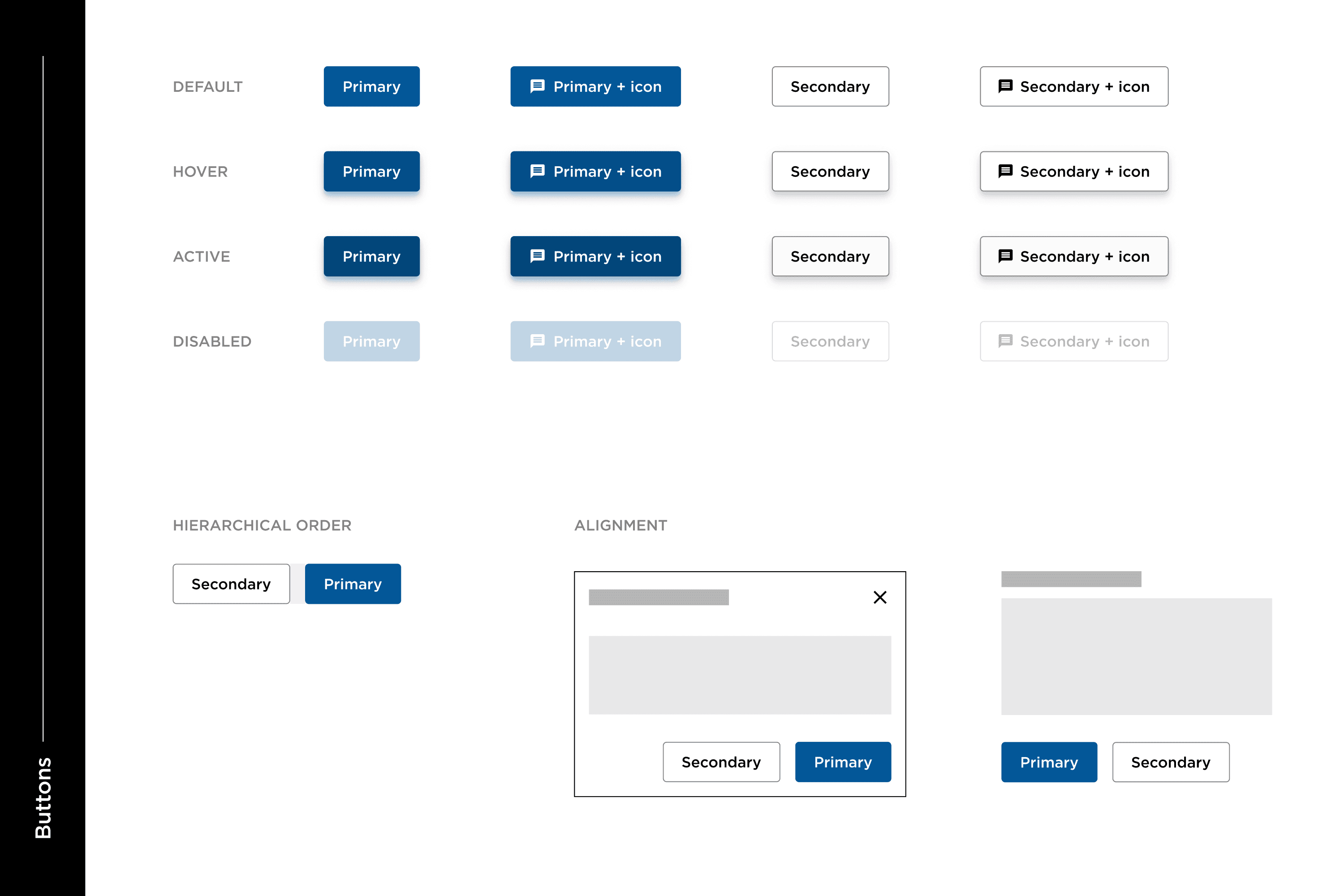
Given the tight timeline of just nine months for developing the in-house platform, the Engineering team opted to leverage the Material UI component library. This decision required a nuanced approach, requiring a blend of familiarity with Material UI's core components and strategic decision-making on whether to build entirely custom components.
A significant challenge arose from the fact that I was the sole designer in the company, without dedicated time to focus exclusively on the design system, as my time was concurrently spent on designing the MVP platform.
Goals
Consistent design language and user experience
Reduced development time: Leveraging as much of the existing Material UI components’ functionality and UI
Flexible and dynamic: Ability to be extended and improved over time
Design Process
Early Ideation
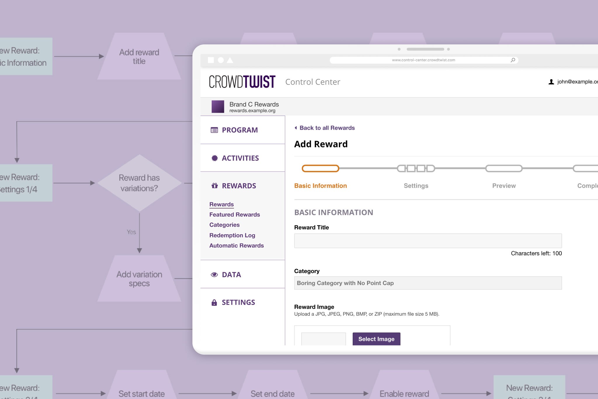
I began planning out the design systems by studying the existing Bubble platform. This involved analyzing current layouts, identifying commonly used components, and assessing layouts that didn’t effectively accommodate their associated datasets.
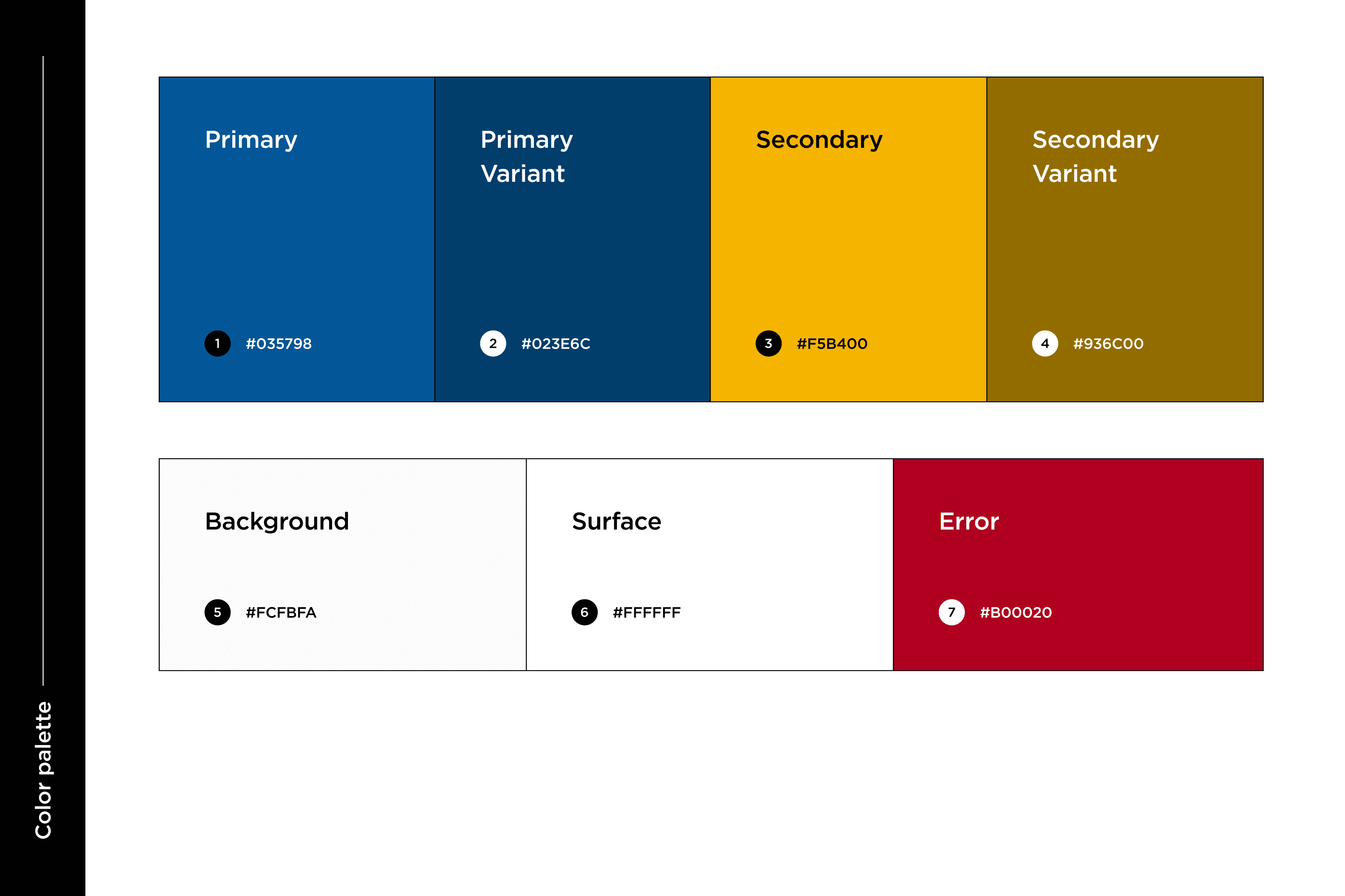
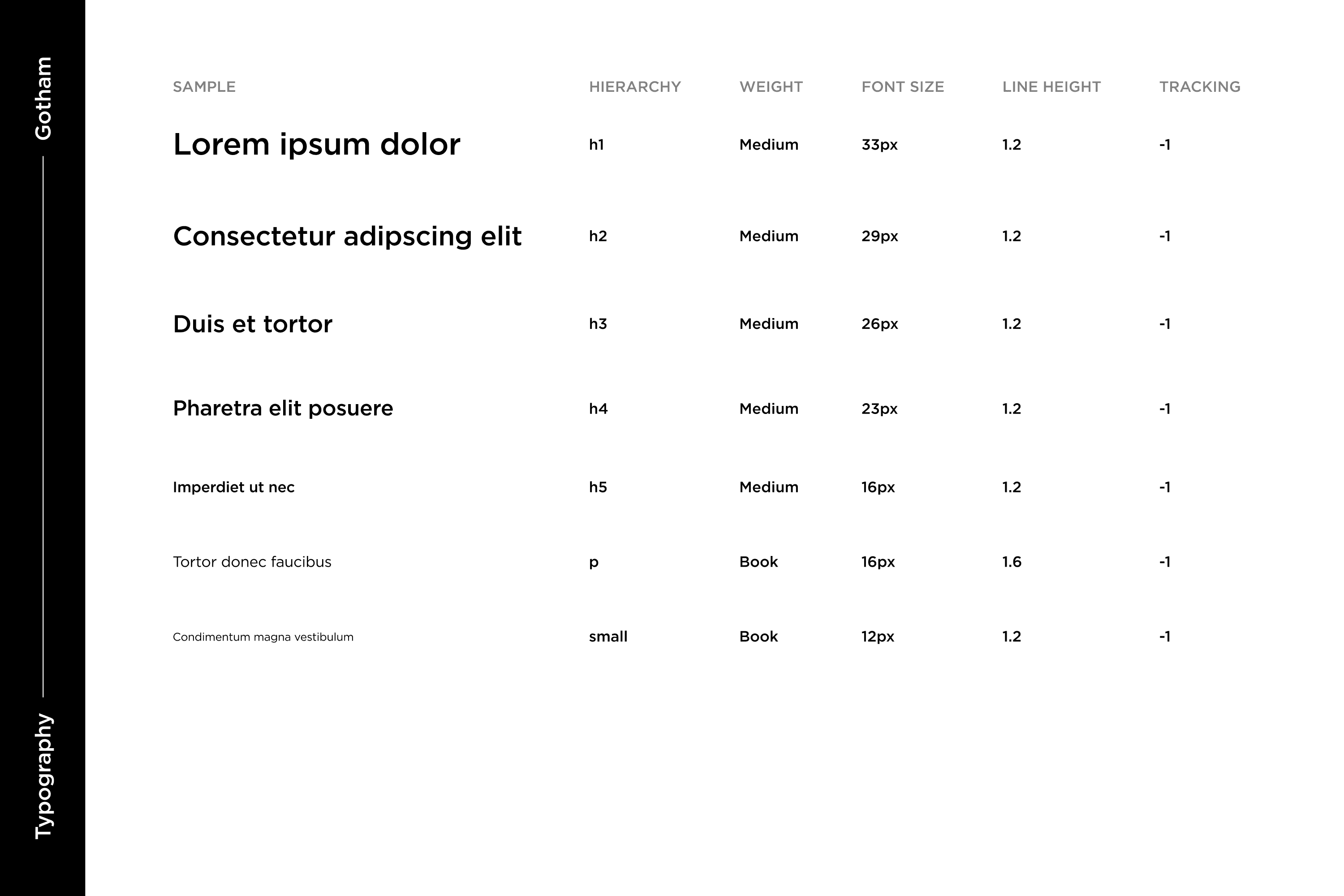
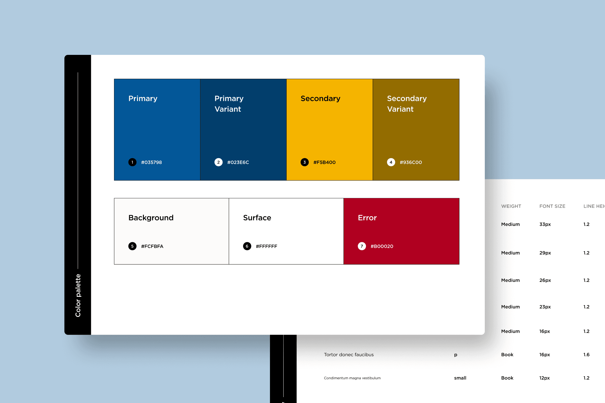
Around the same time, the marketing website underwent a rebrand. Positive responses from members fitting our "ideal consumer" category led us to use it as a reference point for the brand palette and typography direction.
Testing
During this period, while reporting directly to the CEO, I regularly held meetings with her to review all ongoing design materials. As the sole designer, I personally tested components to ensure their suitability for various use cases and layouts, held design discussions with the Product team during our weekly meetings, and incorporated changes as needed to meet accessibility requirements.
Results
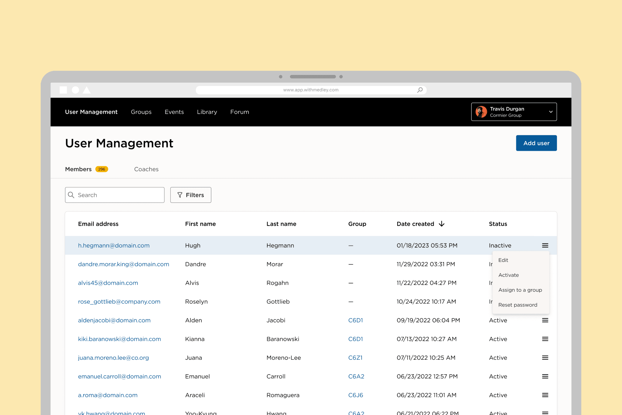
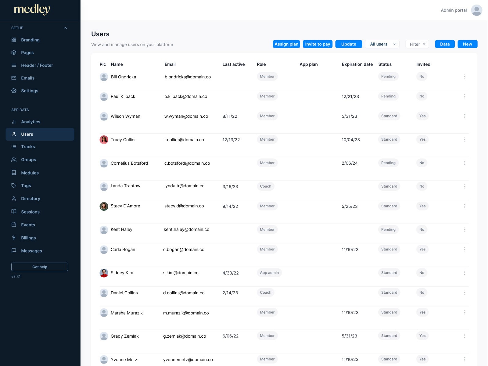
The final designs were built with the flexibility required for both the Community Manager Platform, primarily dedicated to internal tooling, and the Member Platform, centered on self-growth tools and community building. The straightforward color palette, color themes, and typography were deliberately chosen to facilitate future extensibility.
The implementation of the design system provided the Engineering team with the necessary speed to launch all our in-house platforms on time. The majority of the Material UI component customization was front-loaded in the initial two months of development, significantly decreasing throughout the rest of the platform project.
Gallery
Bubble platform
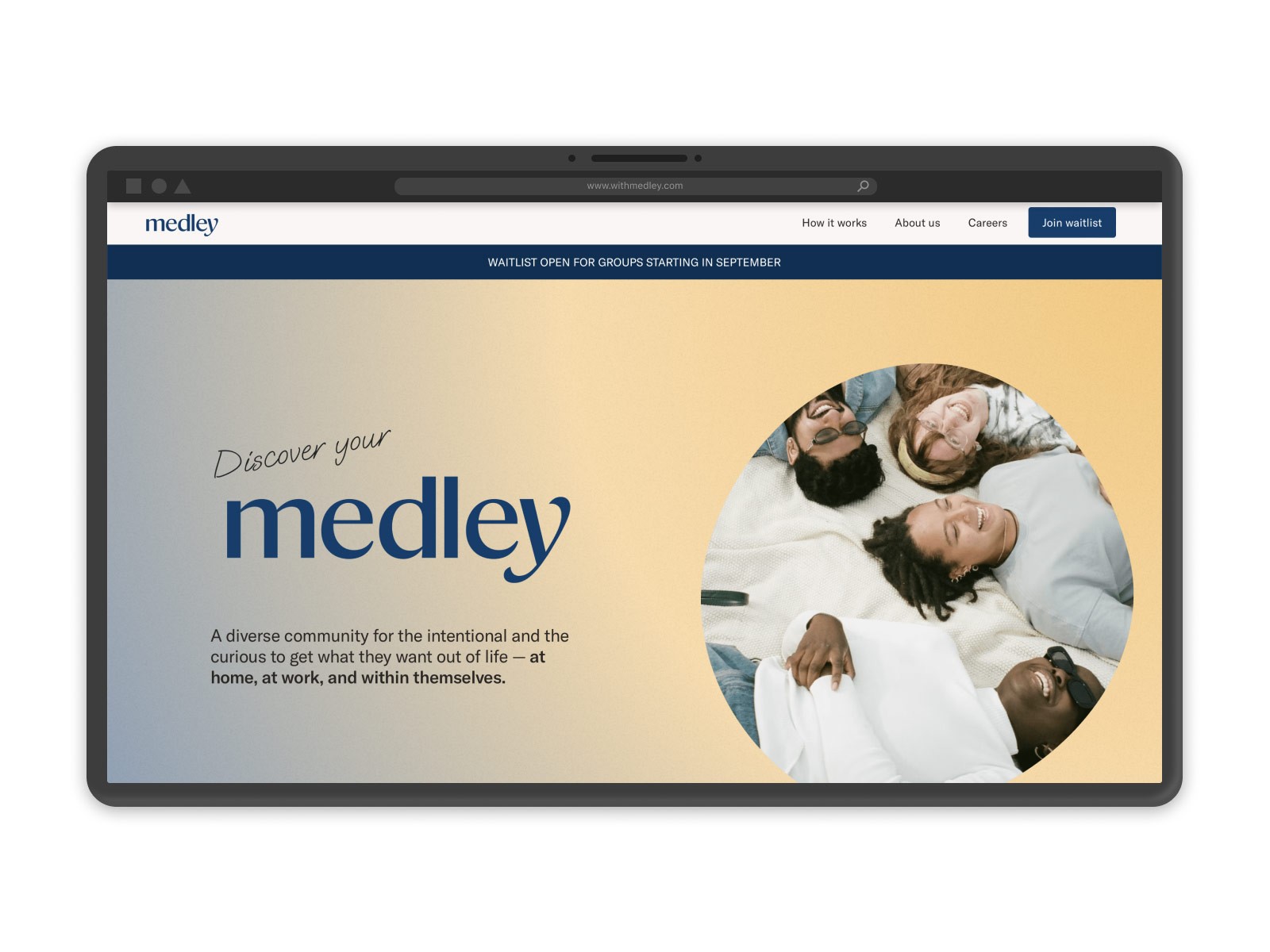
2022 marketing website rebrand
